Aspire

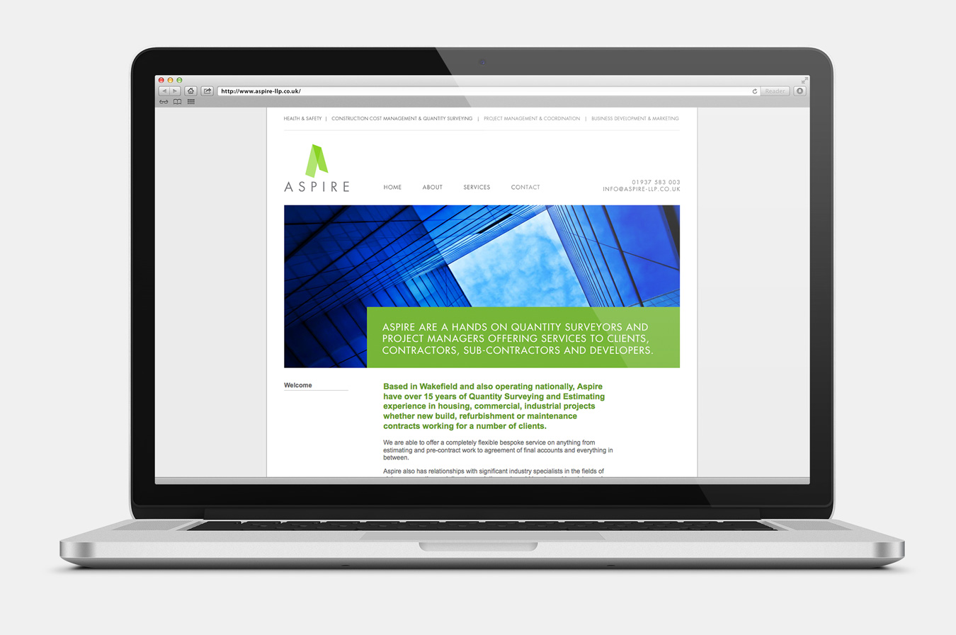
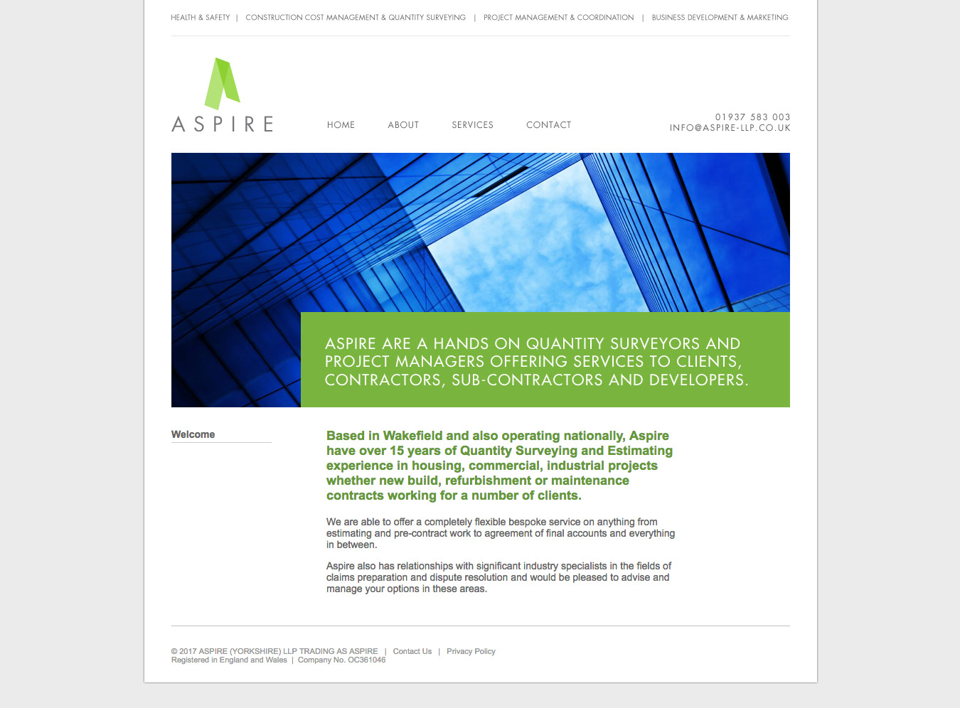
Aspire
As quantity surveying is heavily connected to construction, I wanted to create a type of structure for this identity. So I used the capital A of Aspire to define a space. Introduced transparency to the colour, which exposes partly formed diagonals and a more layered view of the shape. Utilising lots of white space and strong margins, the identity uses it’s main green colour to highlight areas of importance and gain the attention of the eye.
Client
Aspire
Date
February 2011
Website
Category
Art Direction, Digital, Graphic, Identity
Related Projects
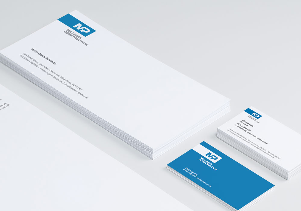
Millpark
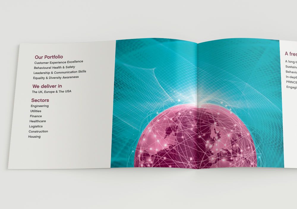
Juice Learning